Restaurant · Restaurants, bistros and wine bars
Windfall
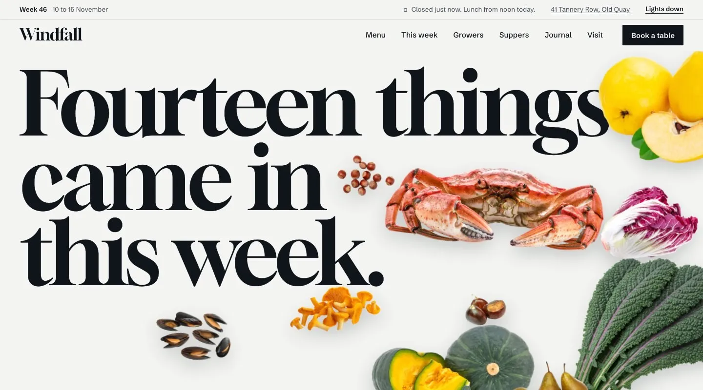
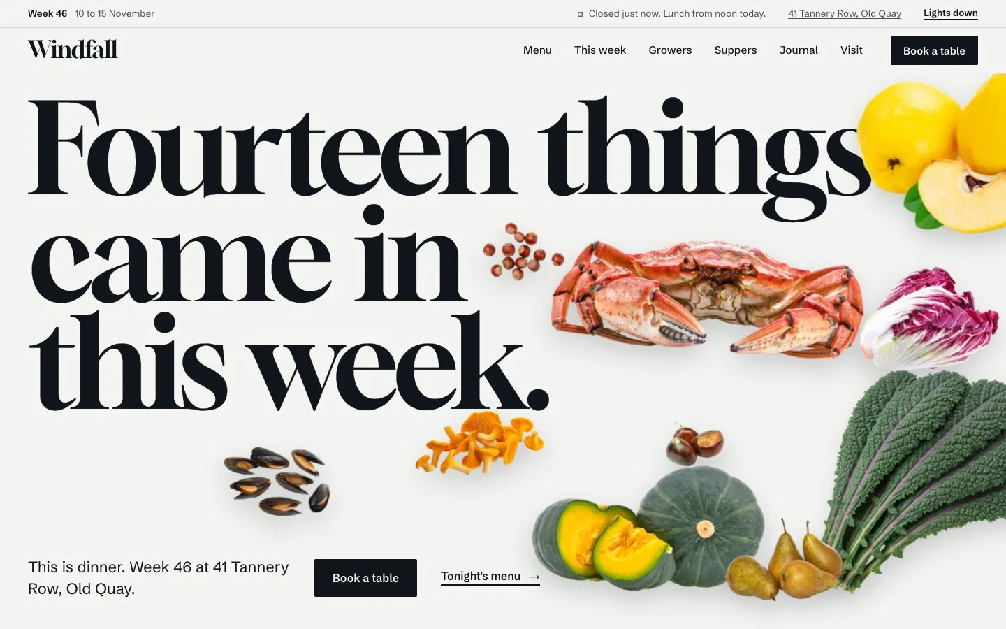
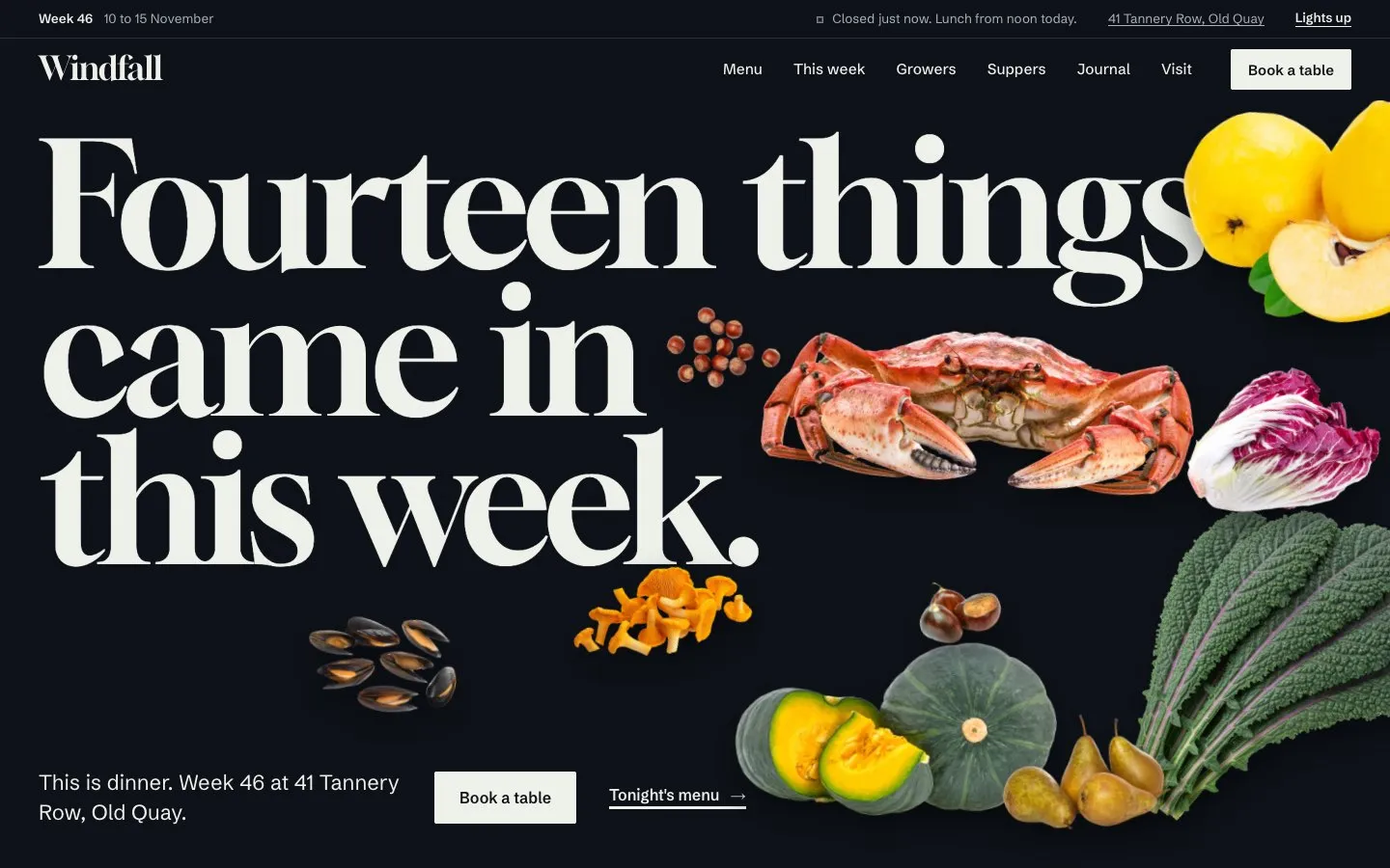
A restaurant website that opens as a still life: the week's fourteen arrivals fall onto the first screen around a poster headline, every dish shows what it is made from, and every ingredient names its grower. Two home pages, 24 page types and five collections, in light and dark.
- Pages
- 9
- Modes
- Light and dark
- Responsive
- Desktop, tablet, phone
- Versions
- Framer, Code, XOXI
About this template
What Windfall is
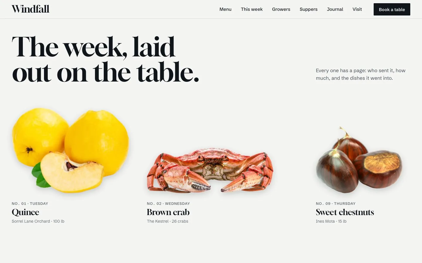
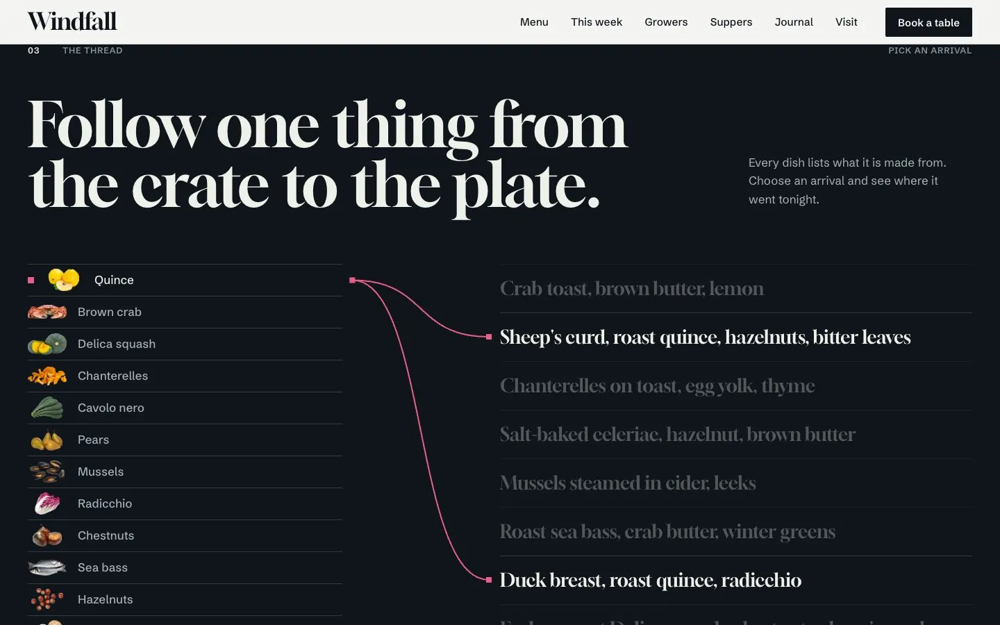
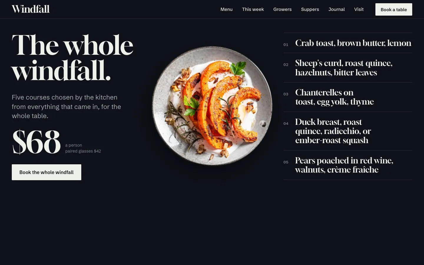
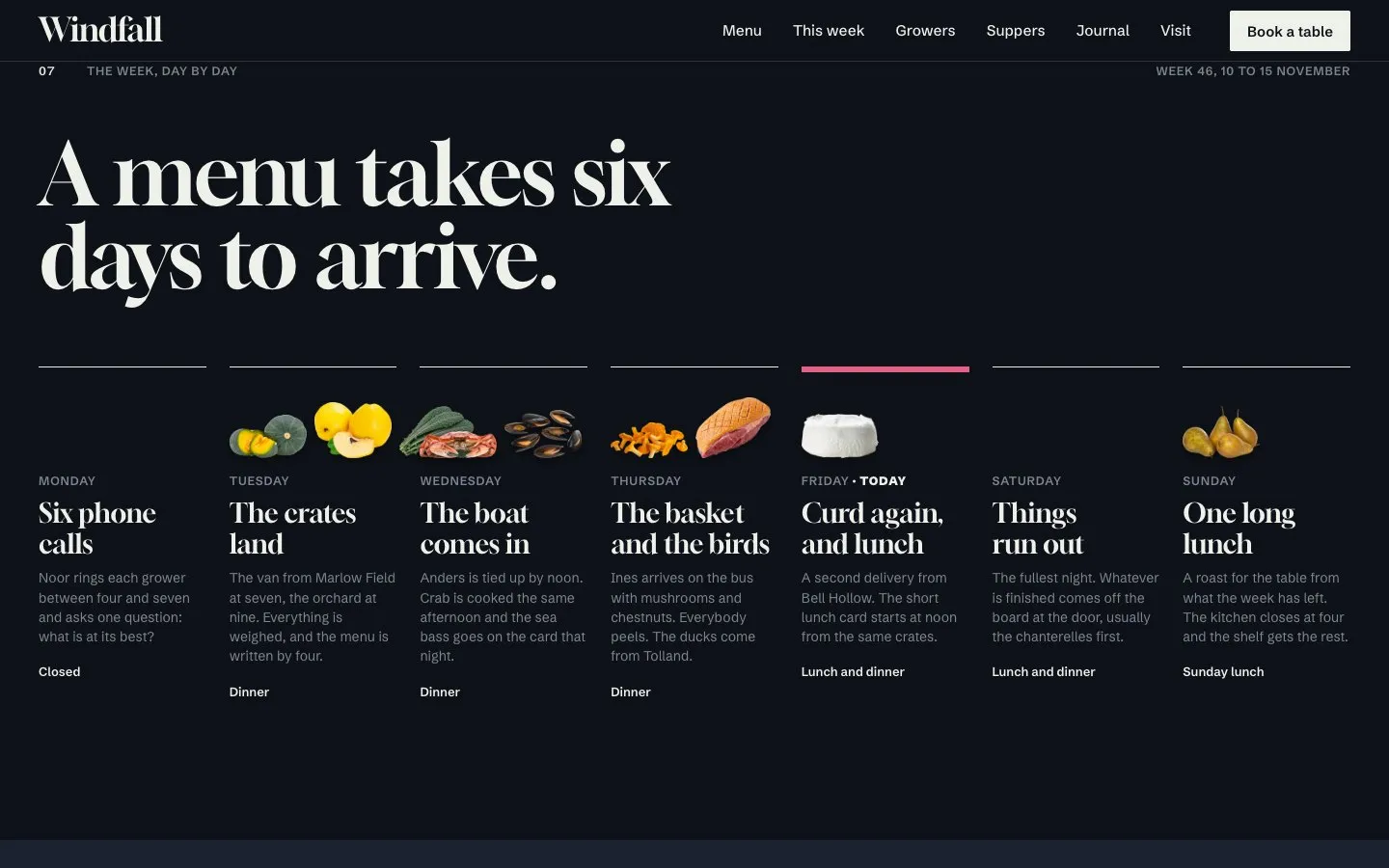
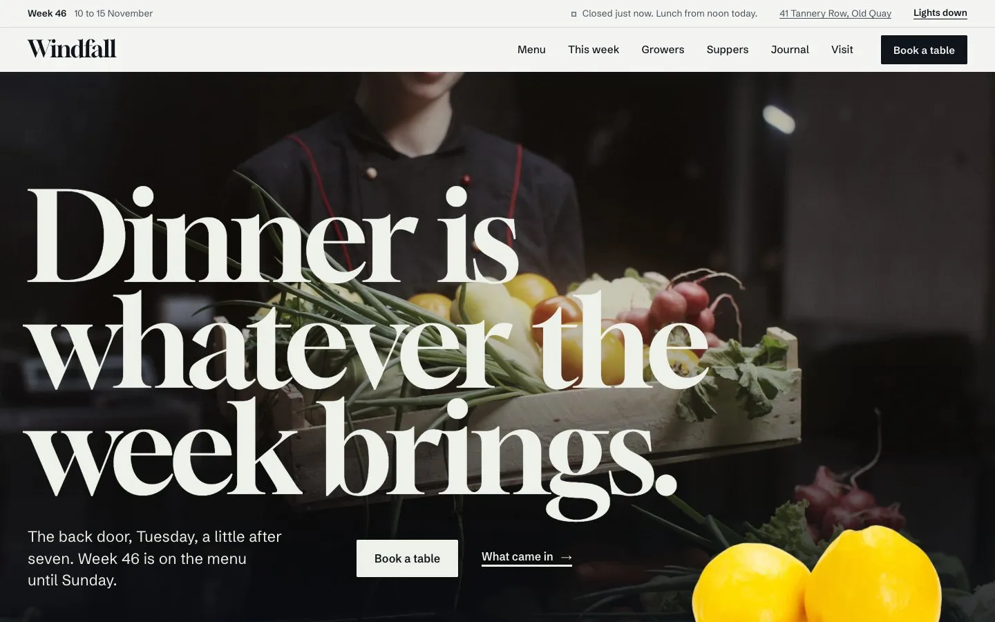
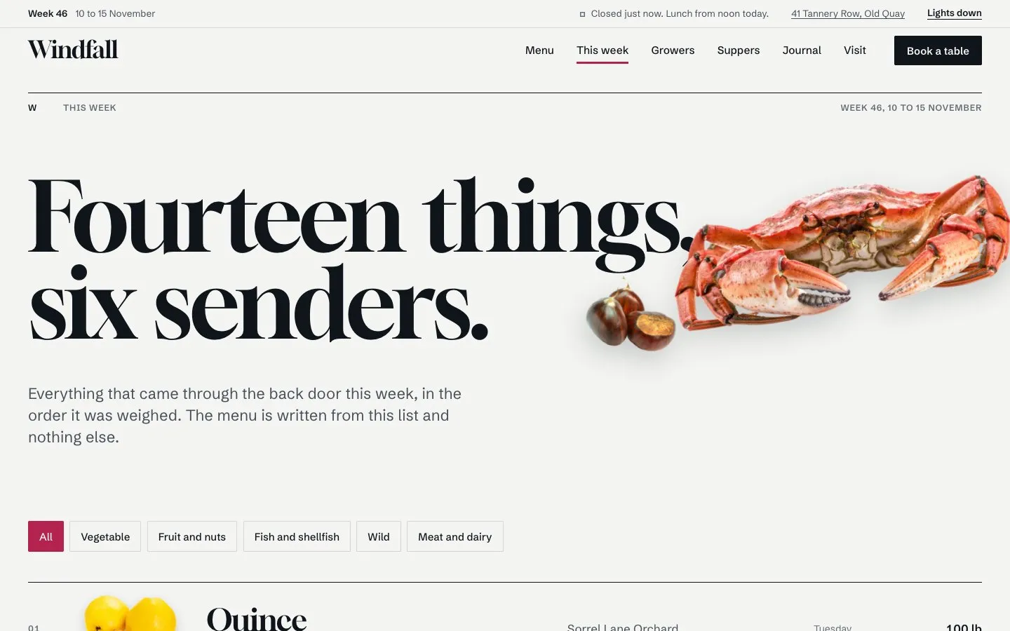
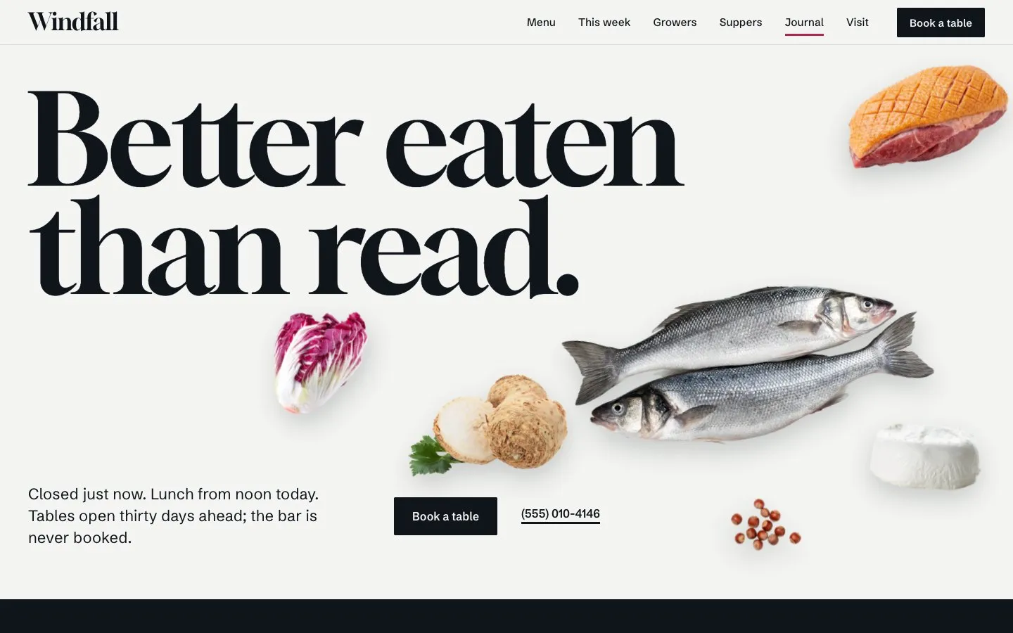
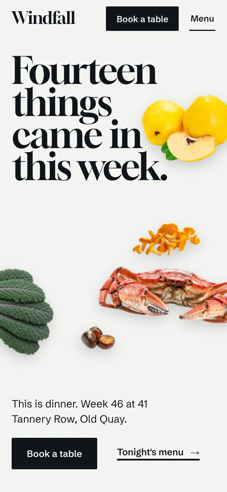
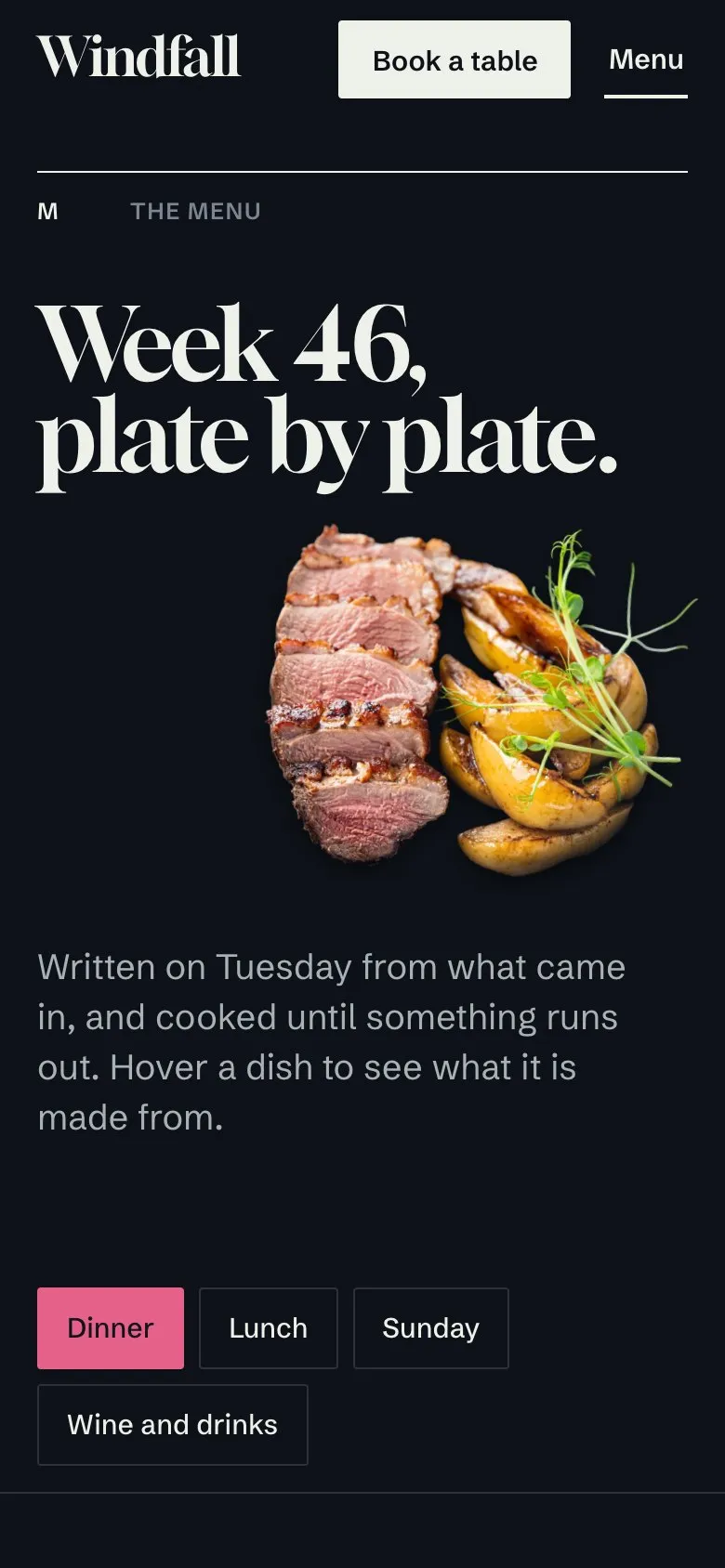
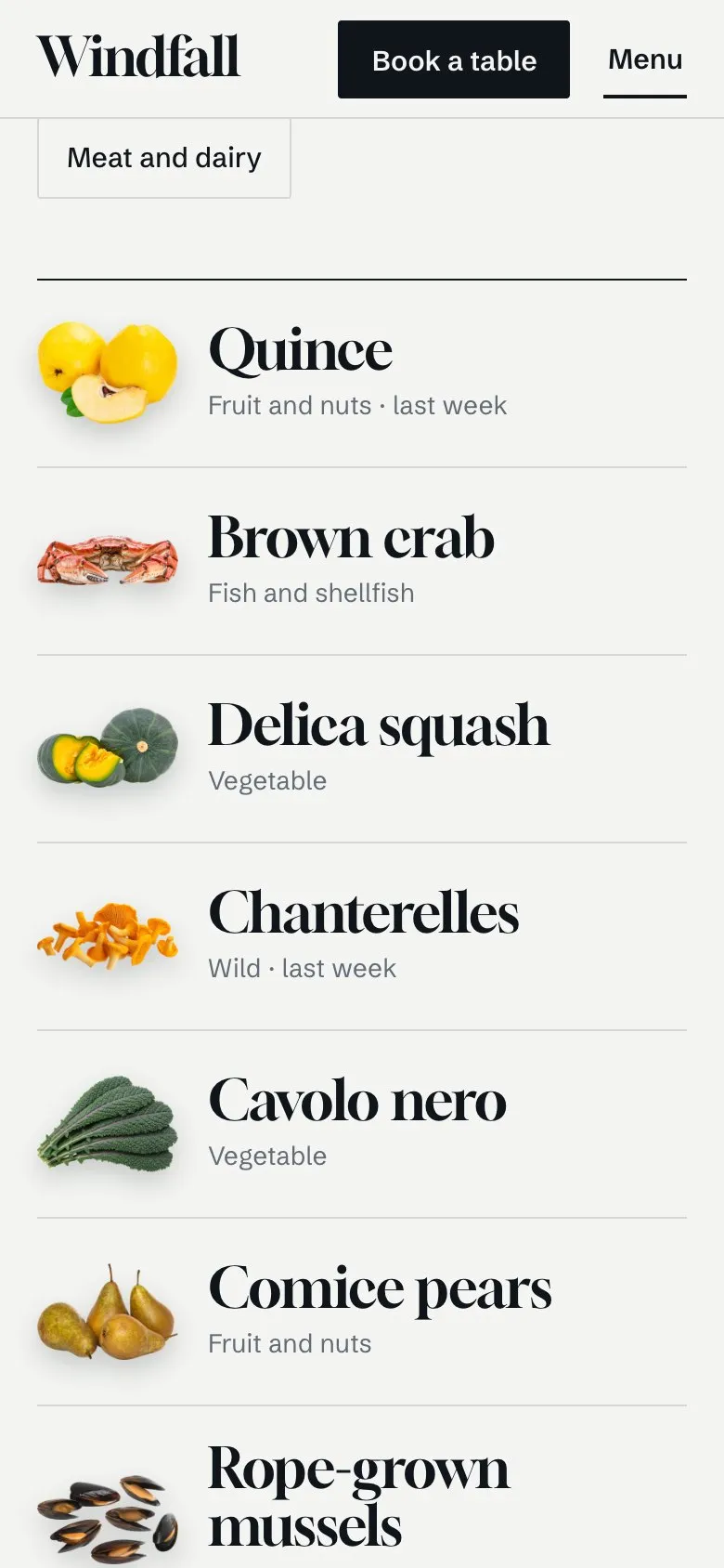
Windfall is a website for a restaurant whose menu follows what arrives. Its first screen is a still life: quince, crab, squash and seven more fall onto the page around a headline set at poster size, settle with a spring, then move with the pointer and the scroll. Below it the home page runs to sixteen sections: the week in one sentence with the produce set in the line, a wall of arrivals, a thread that draws a line from any arrival to the dishes that use it, the kitchen's five courses beside a plate that turns as you scroll, the room, six growers in a row you pull sideways, the week day by day, a season chart, suppers with seats left, private rooms, wines by the glass, press, journal, a drawn map and a closing still life. A second home page opens on a full-screen photograph instead.
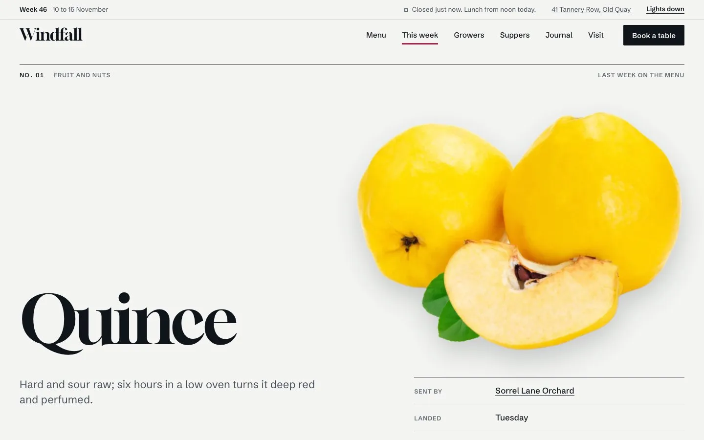
There are 24 page types, among them a menu in four cards, a page for each of fourteen ingredients, six growers, six suppers, six notes and six people, private dining, gift cards, a four-step booking request, questions, careers, a style guide and a licence and changelog page. The masthead says whether the restaurant is open right now in its own time zone. The week, the hours, the arrivals and the menus are each set once in typed files and every page reads from them.
The palette is quiet on purpose: plate white, a blue-black ink taken from mussel shells, and one radicchio-crimson accent that marks what is chosen. The rest of the colour comes from the food, shown as cut-outs, and from photographs that share one warm grade, as if lit by the same kitchen. Type is Gloock with Schibsted Grotesk. Every page is designed in light and in dark, the layout adapts to desktop, tablet and phone, and every motion becomes still when a visitor asks for reduced motion. The restaurant, its growers and its prices are invented, and the photographs are for demonstration only, so replace them with your own before you publish.
Last updated
What's included
9 pages, ready to fill in
- 01Home and Home 2Home in 16 sections from the still life to the closing one; Home 2 opens on a full-screen photograph with tonight's nine plates under it
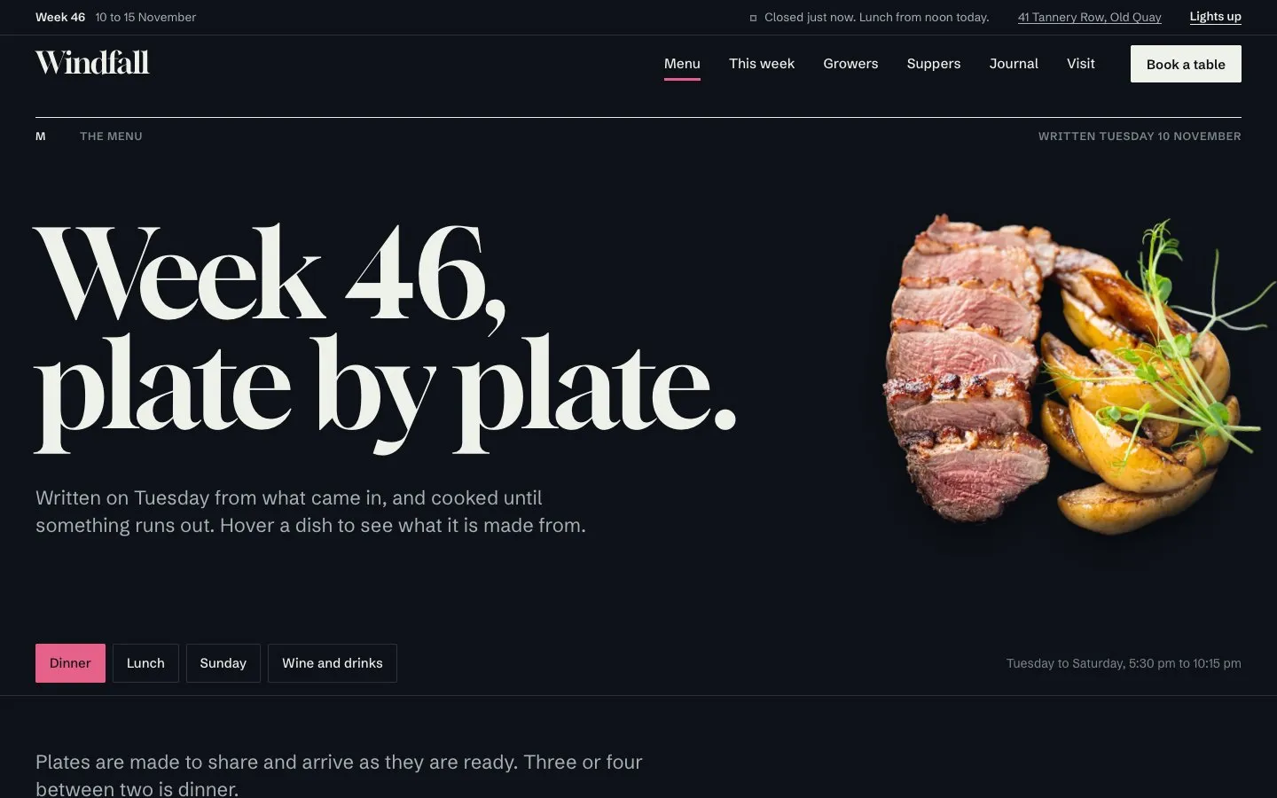
- 02MenuDinner, lunch, Sunday and wine as four cards; each dish shows the arrivals it is made from on hover, with diet marks, three pictured plates and the kitchen's five courses
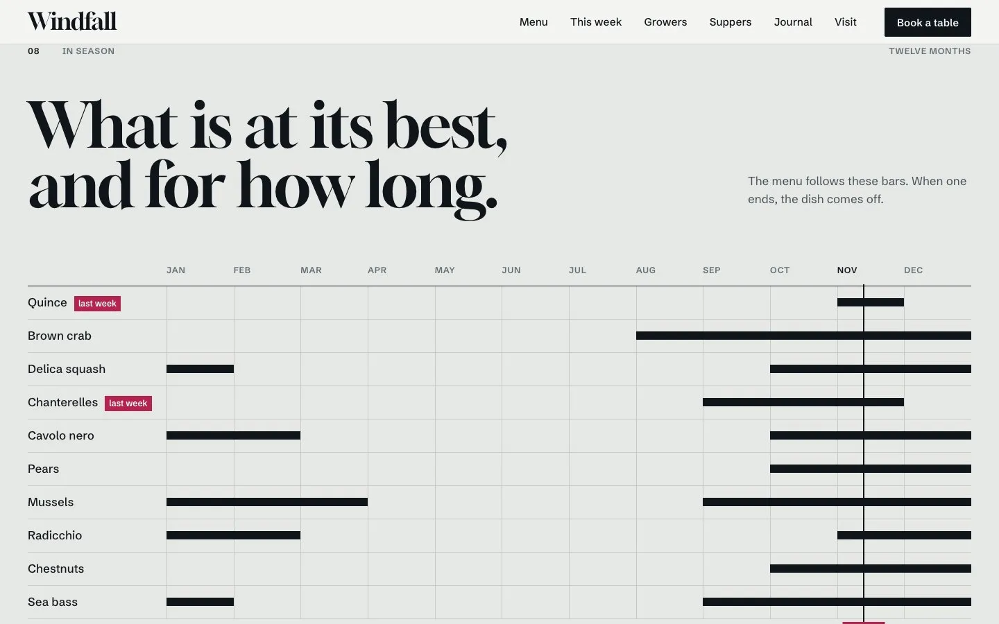
- 03This week and each ingredientFourteen arrivals with a kind filter, what is leaving and what is expected, the week day by day and a season chart; each ingredient with its sender, amount and dishes
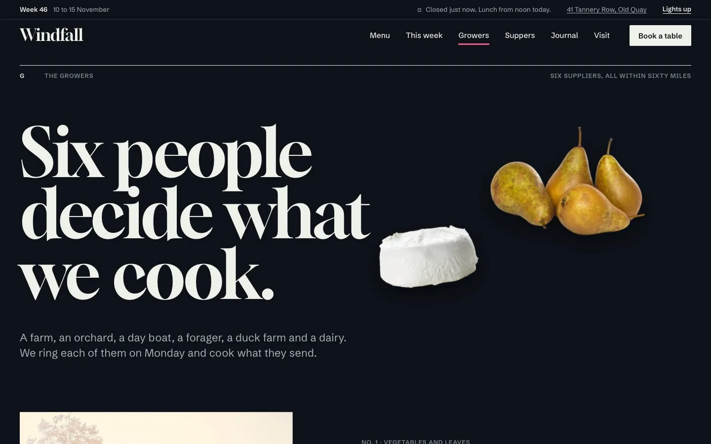
- 04Growers and each growerSix suppliers with a distance scale; each with a story, how they work and what they sent this week
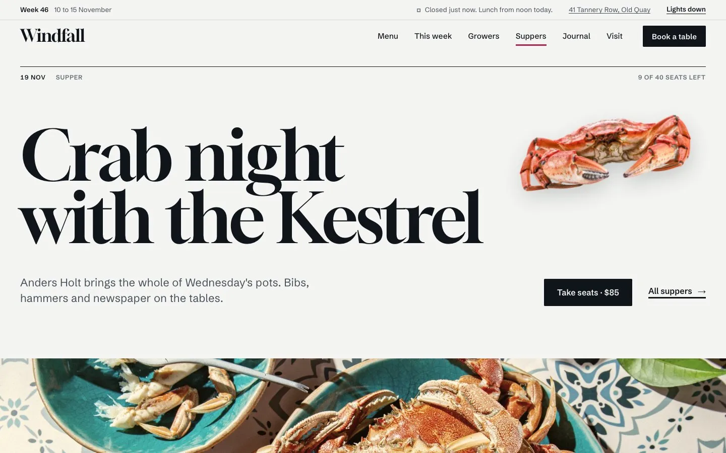
- 05Suppers and each supperTicketed evenings with date, price and seats left, numbered courses and a form to take seats
- 06Private dining and gift cardsThree rooms with capacity and minimum spend, three menus and an enquiry form; three gift cards with an order form
- 07Journal, about, people and each personNotes with a filter and full articles; the story, four rules, a timeline and figures; six people with a page each
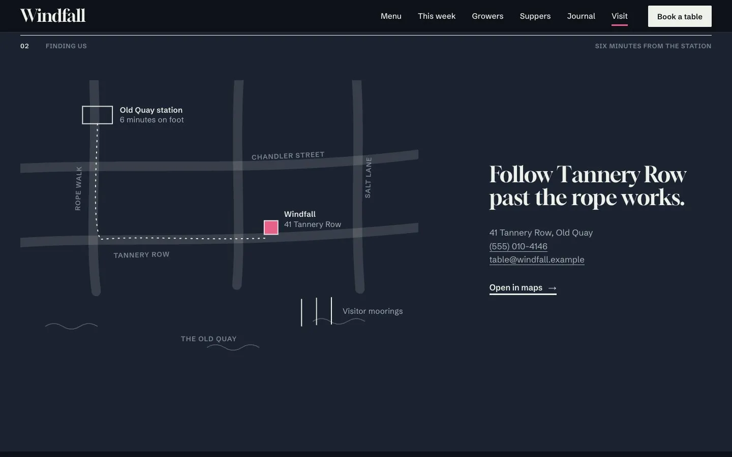
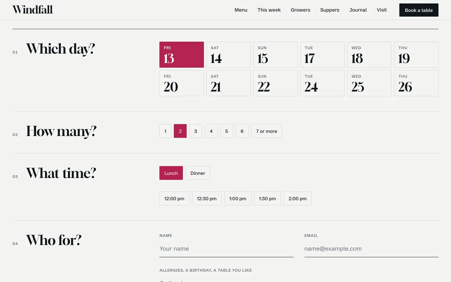
- 08Visit, book, questions, careersHours with today marked, a drawn map and four ways to arrive; a four-step table request; answers in four groups; open roles with pay
- 09Style guide, licence, legal, 404Every colour, size, button and picture treatment; the licence in plain words with the changelog; privacy, booking terms and a 404
Features
- Five collections: ingredients, growers, suppers, notes and people
- Open and closed state in the restaurant's own time zone
- Dishes list the arrivals they use; the thread, menu rows and ingredient pages follow
- Cut-out specimens and one warm grade for photographs
- Eight motions, each with a reduced-motion version
- Light and dark mode, responsive on desktop, tablet and phone
- All content in typed files and nine colour tokens
Code version
- React 19
- Vite
- Tailwind CSS 4
- TypeScript
- Motion
- React Router
- Content in typed files
Screens
A closer look
Taken from the live demo, in light and in dark, on desktop and on a phone.
Where to get it
Three versions, one design
Pick the one that matches how you build. The pages and the design are the same in each.
- Framer templateRemix it into your Framer account and edit on the canvas. Projects and journal posts run on the Framer CMS.
Free on FramerFramer Marketplace
- Code on Digital Silk RouteThe full source: React 19, Vite, Tailwind CSS 4, TypeScript. Host it anywhere and change anything.
$5one payment
Buy theme · $5 - XOXI themeA theme for your XOXI profile. Live on the XOXI website now; the iOS and Android app gets it with the next app update.
Includedfor Pro and Business+ members
Get it with Pro plan on XOXI
Want to see it first? View demo
More templates
Others you may like
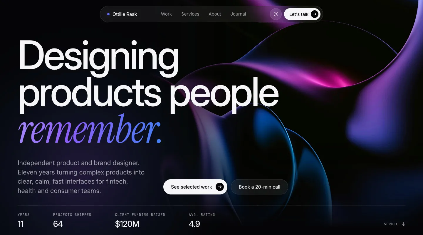
Pagina
A multi-page portfolio template for independent designers and small studios, with light and dark mode.
Free on Framer · $5 code
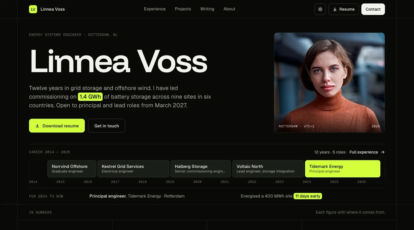
Stint
A multi-page resume and CV website with a career timeline, a printable resume page, and light and dark mode.
Free on Framer · $5 code
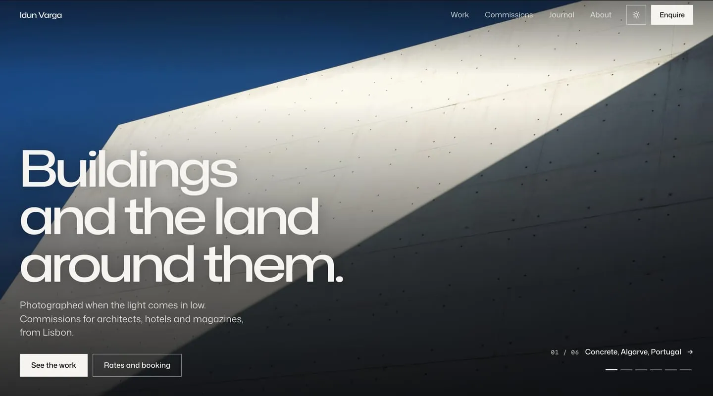
Sidelit
A multi-page photography portfolio where the photograph in view lights the page, with every frame shown whole and light and dark mode.
Free on Framer · $5 code
Want one made for you?
Start with a free 30-minute call. You get a written plan and a fixed quote before any work begins.
Fixed quote. You own everything we make.